Reality Design has an extensive and varied background in packaging design spanning over 25 years. We develop creative packaging solution for your product. Reality Design ensure effective brand management from concept to shelf by offering our expertise in the earlier development stages of your product – product name, logo design, branding, point of sale, digital marketing management right through to the end user, the customer.
This turn-key approach ensures exceptional value for money and guarantees that all interactions customers have with your brand are synonymous with recognition, quality and trust.
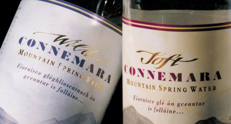
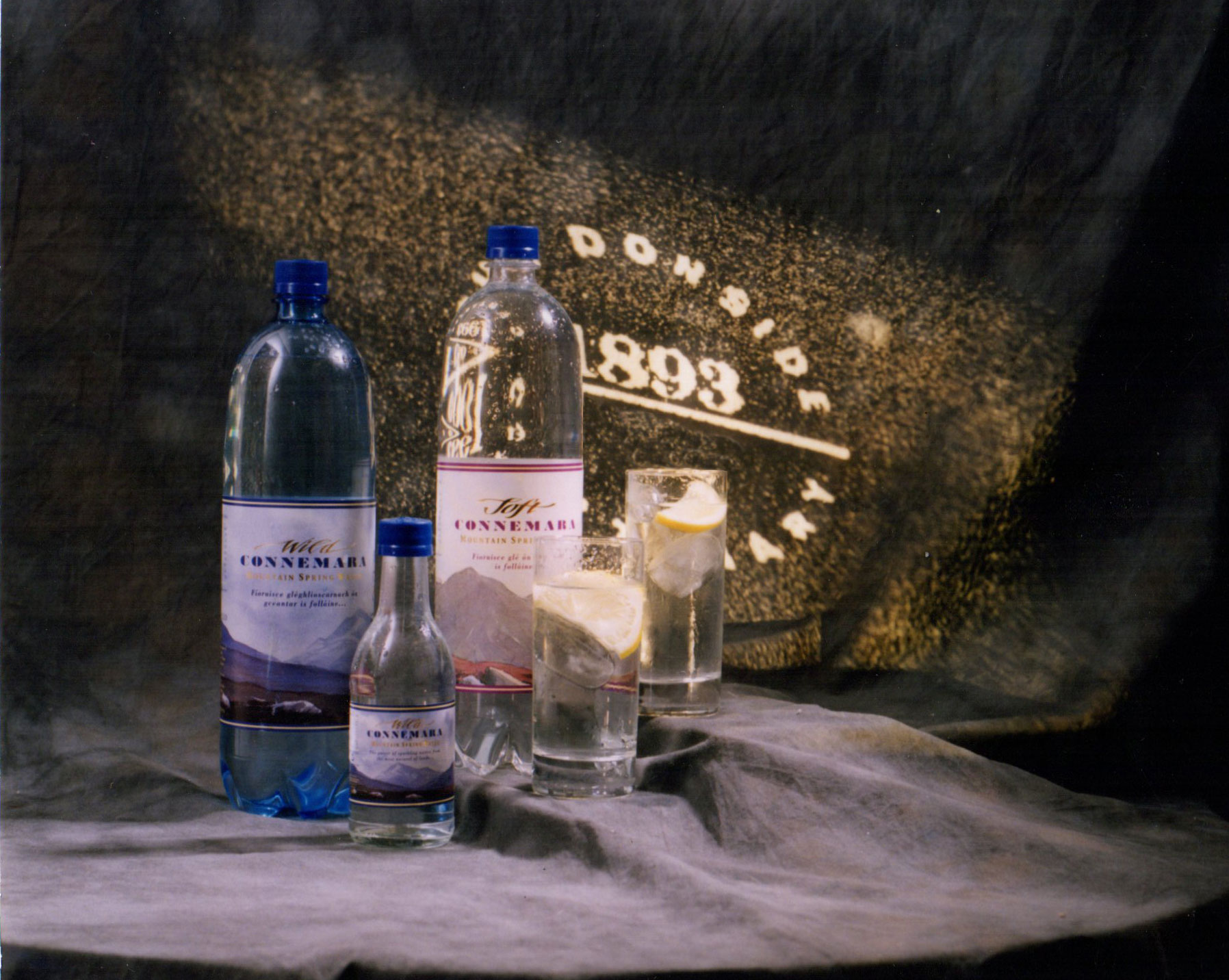
Winner of a Donside Award (England) for our client Connemara Spring Water product label. The label marries hand drawn type, gold foiled set on original watercolor paintings by Peter Knuttle. The concept was to promote, withing the label, the uninhabited west of Ireland region ,where the water is sourced promoting the natural purity of the product.
We designed the original branding using the backdrop of the wild Atlantic Ocean as the base of our inspiration. The Gaelic brand name Rí Na Mara, in English, means King of the Sea and the logo represents this ,with graphic representation of the waves forming the shape of a crown. The background is a painting and this is used as a full wrap around the box ,while the logo is Copper foiled.
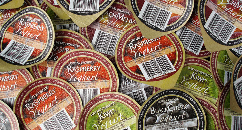
Our client Tipperary Cheese needed us to design a range of yogurt tops. As the printing process of the tub was limited, we advised the client to upgrade the printing to 4 colour process on the foil lids. As the packaging is mainly viewed from above, it was a simple identifier for the customer to choose their flavor.
A packaging range for Irish Organics, a seaweed based cosmetic range. The line, drawing detail to the top of the packaging, combined with a more “traditional image” of a silk background, marries the organic nature of the ingredients with the luxury of a top end beauty product. The packaging was developed for the complete range.
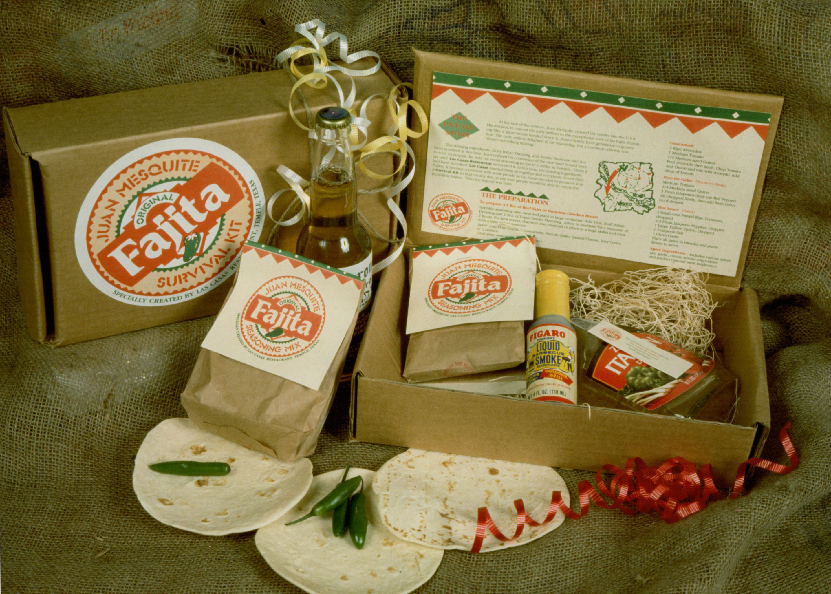
Fajita marinade “kit” developed for a Mexican Restaurant in Waco, Texas. Not having the volume required for a larger print run Reality developed the “kit” by using a mix of printed card, printed sticker and sourcing of standard bags and boxes. The result was an in house product which the restaurant patrons could purchase, adding to their dining experience.
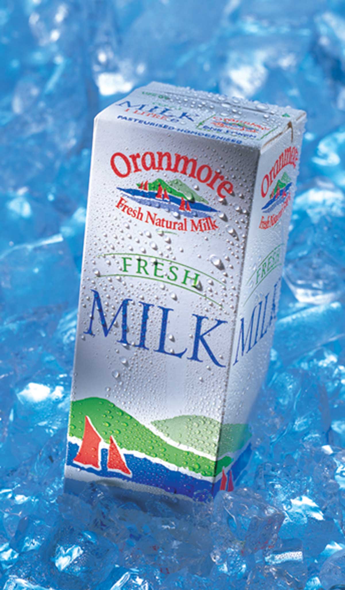
A milk carton for Oranmore Dairies who supply the Galway regions. We illustrated Galway Bay with the traditional red sail hooker boats, set against the vivid colours of the sea and mountains. The result is a “fresh look” carton with a regional concept without being cliche.
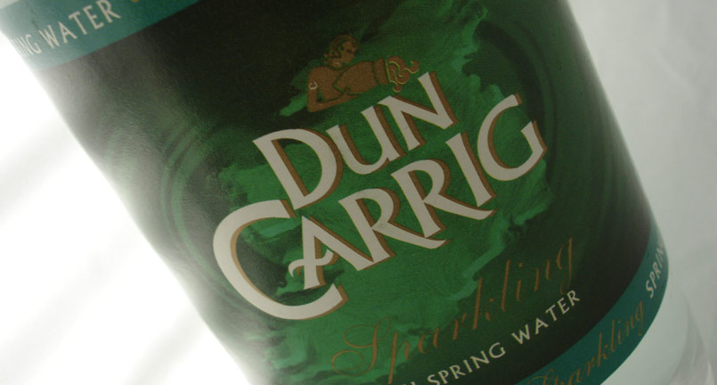
Dun Carrig still & sparkling water labels were design in fresh, bright colours. The design worked in the blue for still and the green for the sparkling, re enforcing the labeling and the colour change eliminated the confusion between the choice of waters.
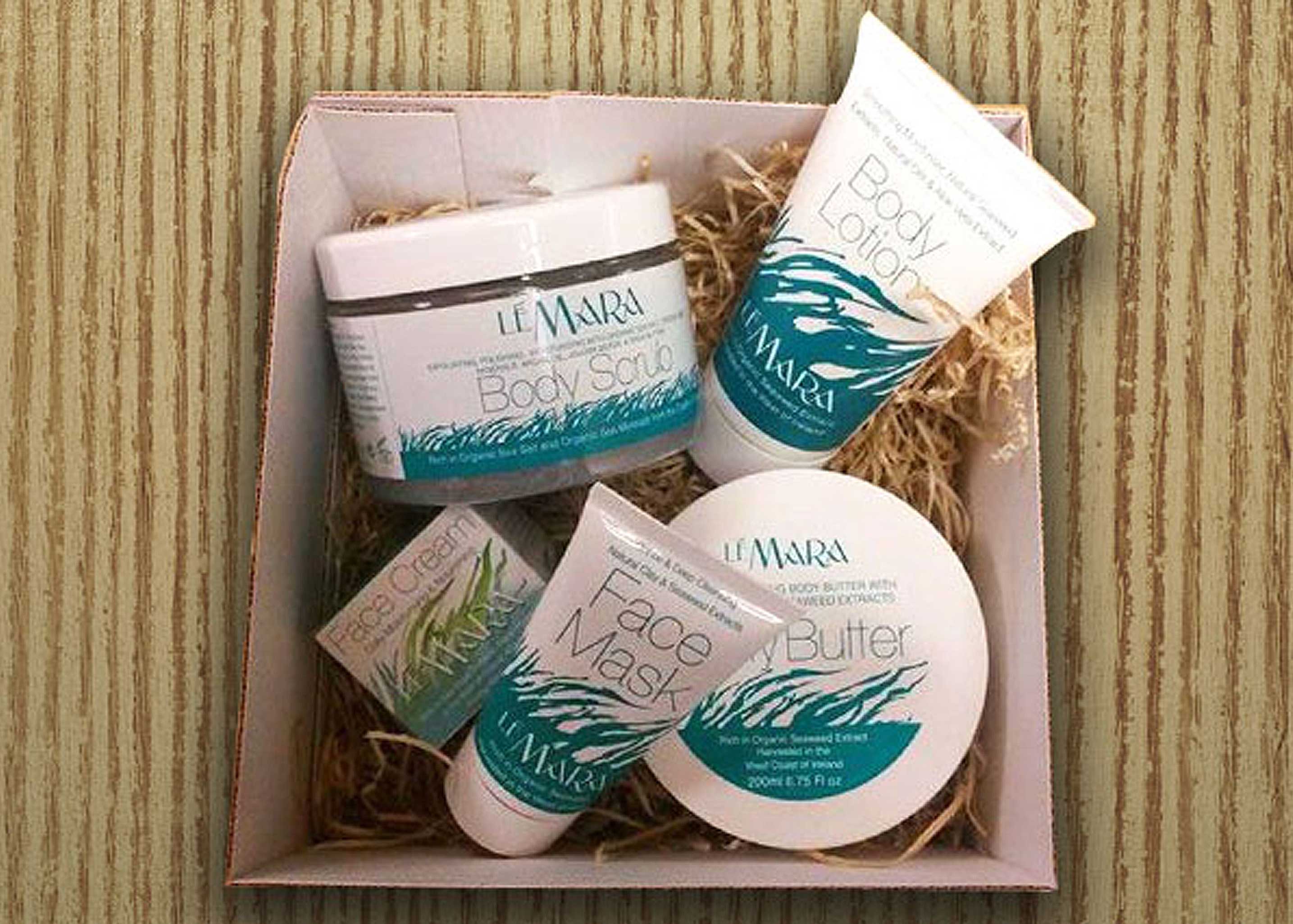
A “generic” range of seaweed cosmetics developed exclusively for an ALDI Supermarket range. The aim was to develop the packaging in a single colour across the range. This was achieved by using an illustration of the main ingredient- seaweed – submerged and flowing in the tides. The Face Cream, a premium product, Reality advised to create box packaging for better presentation.
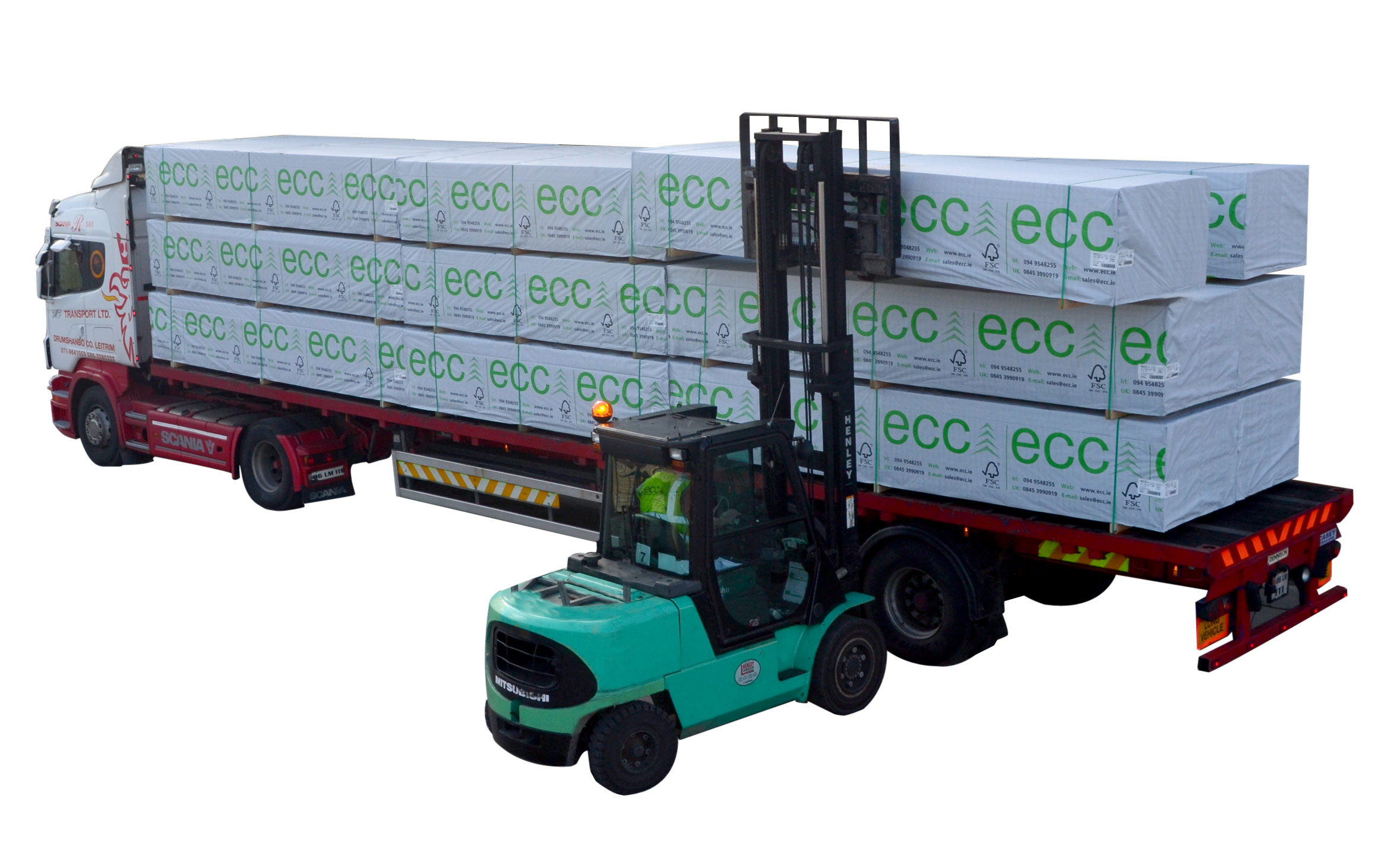
Having developed the logo and branding for ECC a natural progression was to print the wrap which protects the timber from factory to site. The logo was repeated on the material and when the product is stacked for delivery, it creates an impressive part of the company branding.
Questions … drop us a line!
Or call us on 091 555 055
